Thursday 18 December 2014

Photoshoot for my magazine

Front Cover Photo Shoot

Front Cover

For my front cover l wanted a picture to represent the majority of my target audience, so I used myself as the model due to my age, my appearance and my accessibility. Here are a few shots I took for my magazine front cover.


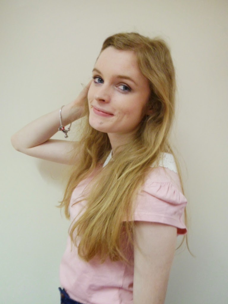
 These are the photos I took for my front cover. All these photos are taken with my own camera since l know how to use it and l can get access to it whenever l wish. The  photo on the right is a photo that l took from my own house, the way l took this was by using a timer setting on my camera and placing the camera on a shelf or heightened surface. However as you can see the picture came out blurry, and I presume it was due to the camera automatically taking the photo then having it manually taken. Also l found the lighting was poor and lowered the quality of my photo. So l decided to get a more professional look i'd need to have better lighting, a plain background and someone to manually take the photo. So l got someone to take the photo of me and found it useful because I'd already expressed what kind of photo l wanted to achieve so we could correspond and have a mutual agreement that my image was of good quality, as it would be on the front cover of my magazine and the first thing my audience would see. I didn't have a tripod for my camera so it was took by hand. The photo l chose to put on my magazine cover was the picture on the top left. I chose this because l felt it represented my audience best and the photography was clear and not blurred. I rejected the two photos adjacent to it because personally l didn't feel they'd appeal as much to my target audience and the angles they were taken at weren't as professional as the picture on the left.
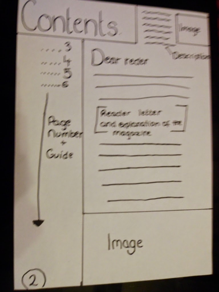
Contents Page

For my contents page I used the same procedure as with my front cover however l took the photos myself of the models that were being used in my magazine. But since l took the photos myself l had more preparation to them, so this lowered the amount of photos l took. So in some cases for this photoshoot l only took photos using one take, because l felt happy with the result and felt it'd appeal to my target audience. Here are some examples of this. 

My double page spread

During this period of time, there wasn't anyone available to take the photos for me, so l took them myself using the camera timer. With previous disasters using the camera timer, l was especially careful and made sure it was in focus and the lighting was appropriate. Ensuring this however, wasn't as simple as l imagined it would be and l still ended up with some photos that were more blurred then l intended them to be.

As you can see the lighting in the second one is two bright, and l wasn't happy with the way these images turned out. I didn't think they were good enough quality or that they would be consistent with my house styles. 
The image l went for in the end was...

As l was more confident my makeup and and body language would appeal to my audience more in this photo in comparison with the others. 


Friday 12 December 2014

Time Management

I haven't been in college all week due to illness so I'm downloading in design to continue my magazine design. Currently I'm still behind but i'm catching up and there should be more blog posts uploaded today.

Monday 8 December 2014

Time Managment

I am sturggling to keep up with my blog posts. They shall all hopefully be uploaded today - I have also planned to take some photogrpahs today of my friends to upload onto my magazine. The reasoning for my lack of blog posts is a lack of work motivation and other heavy lessons which take up my time.

Friday 5 December 2014


 Contents Update 

 This is a update on the work i'm currently doing. My magazine cover 

Thursday 20 November 2014

Design Update

This is a design update on what I’m currently doing, this is what the front cover of my magazine. l had some class feedback, and they like my house styles and the way layout but l need to add a picture and a barcode. I would also like to experiment with the font styles since it looks a little too formal for my target audience, so l could experiment with different fonts. Once l have uploaded my images onto the front cover it will look more professional.
I think that it does have aspects of a music magazine - since I’m filling a gap in the market, I’m trying to find out what works best for the audience I’m trying to achieve.
This shouldn't take too long to complete.

Thursday 13 November 2014

Masthead experimentation

This is the font that l will experiment with and see if it suits the rest of my magazine. It will be for my masthead. I chose it because it looks appropriate for my target audience and it could work really well with the images l have planned to go on the front cover.

Cover line Ideas

For this lesson l decided to think about whatt coverlines l want to include in my magazine. I started to look at what fonts l wanted to use for my masthead-but it took a while to decide so l moved onto creating the coverlines. After l got potential coverlines l picked one and started to edit it on InDesign. I experimented with colours; then got feedback from a fellow student (who is also creating a pop genre music magazine), and she like the position of my splash. 

Friday 24 October 2014

Photography Ideas: Potential Models

Potential Models 

The first person l decided to be a potential model was my friend, Katie. She's 17 and she is also in my media studies group so l thought that would be a great person to choose. She enjoys and listens to pop music frequently so l know she would represent my genre. Her fashion sense suits my magazine and l believe she would connote the youthful and vibrant message i'm going for. I also went for Katie because we have the same college timetable and it felt suitable to go with someone who also had availability to do the photo-shoot. 

The second potential model l have is Mollie, Mollie like Katie also listens to various pop artists and is perfect to represent my music genre. She is a very naturalistic model, which would suit my magazine perfectly. She is very used to the camera so she'd be able to take a good photo for my magazine. Mollie is 1, so therefor shes in the age range which l am targeting my magazine at. However she does go to a different college, so finding the time to do a photoshoot before the dead line may be challenging but I'll try and get it done. 


My third potential model is Callum. He's 17, and like me does media studies. His interests are pop music which although isn't clearly portrayed he could still gain interest from my target audience (females,16-20). I've decided to pick Callum because l think he represents a young male artist who's new in the scenes of the music industry, so the idea will fit into my magazine. Also I've gone for him because l don't want to have just girls on my magazine, l want there to be a equal mix between boys and girls. 
My fourth potential model is Georgina. She suits my magazine perfectly as so photogenic and she has that youthful glow about her. She's interested in bands such as One Direction, 5 Seconds of Summer making her perfect to go on my magazine. She's 17 and goes to my collage so her availability to take photos is fine. She has a unique style which would suit my magazine since i'm trying to differentiate it from other magazines. 

My fifth possibility is Nick. He's 16 however pop music, isn't so much his interest. However I've thought about this and in my music magazine l wanted to push my target audience into trying other music tastes and l think Nick's perfect for portraying a more rock music style. This won't be a dominant factor in my magazine just something l think would refresh the look of the overall magazine. Also like Callum, he portrays a single artist figure which would help promote new upcoming artists. Which is one of the main themes in my magazine, therefore l think nick would suit it perfectly. 
My third potential model is me. Purely because l know what l want to get out of my models so l know how l should be photographed. I am heavily interested in the pop music and l already have possible outfits to wear for my magazine. Also l am obviously available at all times to do photography.

I am unsure on which models l will actually pick, but it will be within the images I've selected above. 

Photography Ideas: Photo Shot Ideas

My Front cover

My front cover will be a posed picture with the model looking directly at the camera. This allows the audience to be directly addressed by the model on the front cover/ The above picture is a perfect representation of how i want my front cover to look. Bright make up to make the face stand out. The hair and make-up will be done precisly but the skin and weight of the model etc will not be changed. As l want to have real life models, instead of airbrushed ones. This front cover picture will be a busy, medium close up.
Overall the front picture will be a bright, high key photo that has been taken in a stuido to make my magazine look professional and appeal to my target audience.

My contents page 

In my contents page i will have 2-4 images of a live band/artist singing. This will be a naturalistic image. The shot type will be mid-shot. It will be on the familiarity a stage, and shall be busy shots to keep the consistency of the front cover image. Other images on my contents page will be things like band pictures and various artists within my magazine. This image type will also accompany the cover lines on my front cover.


Double Page spread

For my double page spread i will use a image similar to the one above. Since these types of images are common in pop magazine double page spread articles. I will use a plain background to emphasize the image of the model. The simplistic colour background compliments the rest of my magazine and the article will overlay the background, the simple colours also connote a fresh, new magazine. 


Make Up and Fashion: Model Ideas

Make-Up

Female Models 

For the Models l want their make up to be simple and natural. This is because l want my magazine to promote natural beauty and to create awareness of that and how you can be beautiful without covering yourself in layers of make up As well as connote freshness and youthfulness. Also if the make ups natural then then it means it would go with my color schemes because there would be no colors to contrast with my house styles. Of course there will be some make up that is more colorful to appeal to those who like that style of appearance. By doing this it will appeal to all types of girls within my target audience. 
The majority of my models will look natural like this: 

Male Models

For the male models there will be no make applied for the same reason as the female models-to create promote natural beauty and self esteem in your appearance. 

Fashion

Female Models 

For my female models l want a range of styles involved in my magazine. As well as a range of styles there will be a variety of models to show different sizes and to show that individuality exists and is a positive thing in our society, The actual fashion the models will be wearing, l can't yet specify, however hopefully the clothing brands will be high street brands so that the readers can access them. The reason for this is that my target audience are students (college/uni, 16-20) so they won't have a lot of disposable income compared with younger generations. So promoting high street brands means that they can feel more involved in the magazine. Jewelry and footwear will be the models choice-as long as it all goes together and looks professional then it will be their choice. 

Male Models 

For any potential male models they will be dressed in just jeans and t-shirts or whatever they feel most comfortable in. Because i'm picking models that fit my magazine and connote a youthful and fresh style I'm not too concerned about the outfits. They will be on posters and to go with some articles so there's less pressure on them to represent my magazine.  


Wednesday 22 October 2014

Magazine Mock Up

Front Cover

This is a mock up of my front cover. I am currently unsure on the colour pallet will be using however l know that the coverlines, splash and masthead will have backing of some kinda to enhance the text on top of it. I have also decided to use a large central image which takes up the majority of the page. The model used will look directly at the camera. 

Contents 


Here is my music magazine contents page. I've decided I'm going to have various sections on things that wouldn't typically be on a contact page such as whats online and current events the audience may be interested in. This is a technique I've only seen in Billboard, which i have adopted and changed to make my own individual feature for my contents page. There will be four images, all related to the front cover to keep it consistent. 

Double Page Spread

Here is my double page spread for my magazine. I have decided to use a large background image which will be of a model looking into the camera, again to that direct access to the reader. I have also decided to use features such as pull out quotes and drop caps. This will add maturity as well as add to the overall appeal of my magazine. My article will be in a question and answer format since that is the most common way of presenting a interview. 

Wednesday 15 October 2014

Content Analysis 1- Top Of The Pops

Images

The images on the contents page are often what the main articles in the magazine are about. The image of the front cover is useful for the audience since it shows where the articles are in the magazine. Also the pictures are usually corresponding with the ones on the front cover to keep the consistency. There are also some fashion and make up pictures to keep the reader interested and it gives them another incentive to buy the magazine. The quotes accompanying the photos usually are words such as "Shocking" and "WOW" to get the readers interest. 

Font style 

The font style is again chatty and informal to keep the reader interested. This form of address is common in pop magazines. The text itself is a combination of serif and sanserif as well as being consistent from this magazines front cover.

Articles 

The articles featured in this magazine are shown under in catorgores to keep the layout simple for the reader to follow. The headings shown are all categorized around generic things a teenage girl would like- "Boys", "all about you", "we love shopping", "wins &offers" etc. These headings are a accurate representation of the pop genre. The main articles are focused on current pop artists and celebrities, perfect for the teenage audience.

Color Pallet 

The color  pallet used is simplistic and vibrant, the three main colors are black, yellow and pink. The simplicity and how basic the color pallet is connotes that the magazine content is stripped back and honest. Giving readers the honest interviews and facts about the celebrities as well as bluntly being about the music. Also the color pallet is very feminine and goes with the front cover of this magazine.

Heading 

There are 62 page numbers listed on this magazine contents page This is typical of a magazine of this type because the price would be about £2.99, meaning there would have to be a lot of content. There is a photo of the magazines front cover, then page numbers directing to the coverlines of the front cover. Useful to direct readers to the right articles they want. 

Language

Like other pop music magazines I've studied the language used is chatty and informal, appealing to the younger generation (target audience). The use of slang and brackets appears more friendly and makes it more direct for the reader. The choice of vocabulary is simple, but not patronizing They use language that the audience can relate to and what they find easy to understand as well as formed to challenge their mentality-especially the youngest of the target audience. So in some ways it becomes a learning resource as well as a music magazine. 

House Style & Brand Identity 

All of the things mentioned above are combined together to create the house styles for this magazine. This magazine differentiates itself from other magazines because it has a picture of the front cover within the contents page. This is the only contents I've studied which does this. So this creates a strong brand identity. "Top of the pops" have a strong brand identity anyway, due to the TV show, so they didn't have to start from the beginning. This helped the business and was able to make the magazine a success easily. The house style of this particular magazine changes every time there is a new magazine, there are still vibrant bright colors to connote the excitement of the magazine but the colors vary and change each time. But keeping the same fonts, layout, masthead keeps the house styles the same each time. 

Monday 13 October 2014

Time Management

We are on week three and l am currently behind with my blog posts. The reason l am behind is because l have used my time to do other courses first, but now l will concentrate on getting up to date.
All blog posts will be up to date shortly.

Monday 6 October 2014

Magazine front cover analysis 2

Magazine Front Cover Analysis 2

The second magazine l chose to analyse was "Top of the Pops" because this magazine is the same genre of magazine that l want to create. I will analyse it to prepare myself for when i create my magazine, so l can recognize the generic conventions of a pop magazine. 

Masthead 

The mastead is "Top of the Pops", this is written in bold and the font is specifically a fun one, connoting the magazine itself is fun and exciting. Also this writing is a unique selling point of this magazine since no other magazine does it. The pink and white show that the target audience for this magazine will be girls. 

Target audience

Most likely the target audience is girls aged 11-16. 

Coverlines

This magazine in particular has a lot of coverlines presented. They are mainly on the left side of the magazine but there is also one on the right side of the mmagazine. These coverlines are the most interesting stories on a magazine and the topicality of them is based on the target audience. So the target audience of girls are mostly interested in boys, bands and upcoming artists. The coverline below the masthead is unusually placed since this is usually where the puff would go, but this magazine doesn't contain any puffs. The main coverline of this magazine is "Ariana Cracks up" this links in with the central image. This draws your eye to it because its placed in a bubble and is bigger then the other coverlines so it stands out and drws your attention to it. In the bottom left corner there is a cover line saying "WOW, whats joee essex done now?". The wording of this makes the reader curious and want to read that specific article. The wow is in bold and a different font to draw attention away from the main coverline. There is also one above the masthead, this is used attract potential buyers towards that magazine because of the amount of cover lines on it. The front cover contains a lot more coverlines then other magazines of the same genre, so it shows that this magazine is busy, fun and exciting. 

Central image

The central image of this magazine is Ariana Grande, because to teenage girls would be inspired by her. In this picture she is happy and her eyes looking into the lense this makes the readers feel more involved with the magazine since you're able to look into her eyes. The shot is a medium shot. Also this is key because the double page spread article is also about her, so it lets the readers know the main story of this particular magazine.

Mode of address

The mode of address for this magazine is typical of a pop subgenre magazine It's chatty and quite informal since it's aimed at a young audience. The informal lexis choices are used to make the magazine easy to understand as well as direct. Slang is used because of the informality of the magazine and explanation marks are used to emphasis the main stories and build up excitement about the magazine. 

Puffs

Surprsingly in this magazine, there are no puffs-however usually in pop magazines puffs are used ont eh front cover. 

Fonts

These fonts are bright and bold to connote a youthful magazine and to differentiate itself from other magazines. 

House styles 

the house styles for this magazine are bright colors and have very famine color palette. This is ideal because the magazie has a female target audience and the bright pinks love and emotions - which the magazine matches with boy bands. Making the ideal mix for a female magazine. In each magazine the house styles can change a little but they still remain bright, vibrant and feminine. 

Brand Identity 

The brand identity of this magazine is "Top of the Pops"-which is familiar and can be related to the TV show top of the pops. This brand identity has been built up over time and now one of the UK's top pop music magazines.. 

Magazine Analysis Front Cover 1


Institution Research ofa music magazine on sale in the UK

Initial Ideas for My Music Magazine

Genre – The genre that my music magazine will be aimed at is a teenager/young adult, the sub genre will be mainstream music. So l am indenting on following the pop/R&B music route, because that is the music genre that l am most interested in and l would be able to use my knowledge to create a professional magazine. Also because l researched magazines of a similar genre, I’ve got to know the generic conventions of that style of magazine.

House styles/ Brand identiy
  • Vibrant colours
  •   Large texts
  • Consistency of colours and fonts
  •  Youthful image
  •   Accessible
  •  Easy to read 

Typical content
  •          Music news
  •          Fashion betrayed by artists
  •          Celebrity news
  •      Music chart

Type of institution that might produce the magazine
  •          Highly known institution
  •     In charge of several other magazines
  •      A professional one
  •      One with enough money to enforce it  

Mode of address
  •          Informal with various formality
  •          Chatty
  •          Relaxed formal  

·        Representation / Ideology values
  •          Positive representation 
  •     A mange of music styles to represent my audience as well as some new ones to challenge their taste and introduce them to music genres they wouldn't expect to see 
  •      Some mainstream values that would be expected in my genre of magazine


Montage illustrating range of music magazine on sale in the UK


My music Genre Wordle


Action Plan

Week 1

  1. Create a action plan
  2. Make a music genre wordl and upload to blog
  3. A collage of images representing different music magazines on sale in the UK
  4. Create a document showing initial ideas for a music magazine 
  5. Institution research of a music magazine
  6. Analyse 2 front covers of music magazines

Week 2

  1. Do a time management update
  2. Analyse 2 contents pages of music magazines
  3. Analyse 2 double page spreads of music magazines

Week 3

  1. An update on time management 
  2. Magazine pitch 
  3. Pitch feedback
  4. Summary of pitch feedback results 
  5. A styles sheet
  6. Mock up of front cover
  7. Mock up of contents page
  8. Mock up of a double page spread 

Introduction to the Main Task

Main task

To create the front page, contents and double page spread of a new music magazine.

All images and text used must be original, and done by myself. 

For me to do this to the best of my ability l am going to carry out intense research and learn howto operate the software needed a little before we start. 

Wednesday 1 October 2014

Student Magazine Analysis

In what way does your media project use, develop or challenge forms and conventions of real media projects?
When l was given the task to create a music magazine l first researched different types of student magazines and familiarized myself with the generic conventions of a student magazine. The common factor l noticed throughout all the student magazines l looked at, was that on the front cover they had a young student looking happy and usually doing a inspirational activity such as revising, holding a briefcase. This is the student magazines central image. Colors in all these student magazines are usually plain bright colors to connote the happy youthful attitude a student may have. I noticed that there are usually only 3/4 main colors, all either complimentary to each other, or purposely to contrast. I chose my fonts carefully since l thought that a sanserif font would be easiest to read for my target audience. I also chose three main fonts as l saw this is how other student magazines were usually set out. The front cover has to include a Masthead, coverlines, articals trailed, puff and central and secondary images etc. These will make my student magazine look professional and appealing. The typical contents page consisted of a 30:70 picture to text ratio as well as information mentioned on the front cover and a guide to what's inside the magazine. I included these conventions in my magazine, so it would look professional and used a consistent color scheme of blue and black throughout my front cover and contents page. Compared to the magazines l looked at, l wouldn’t say l did anything to differently as l am not a expert in magazines and wanted to stick to what l thought would look professional.

How does your media represent different social groups?
Since my target audience is students l wanted to create a magazine that would appeal to 16-20 year olds. My student magazine isn’t aimed at a certain age group, and it doesn’t have a specific gender so my magazine was universal. When l did my audience research the majority of them said that they wouldn’t pay any money for a student magazine and if thy would it would depend on the quality. Using that opinion l decided to make my magazine free, since if it was priced it may not get as much attention from my target audience as l would like.


What kind of media institution might distribute your media product and why?
An obvious place for my magazine to be distributed at, would be a college or a university. This way its in a central location for al my target audience to reach. Since it’s free it would get most attention from these locations and it would be ideal to pick up.

Who would be the audience for your media product?
It would be aimed at 16-20 year olds. There would be no specific gender, so it would be open to all. It’s a magazine set for all classes and all economic situations since its free and won’t cost them anythings. They would most likely be interested in mainstream music, fashion and news since that is what is in the content of my magazine.

How did you attract/address your audience?
I attracted my audience by incorporating their interests into my magazine. I took relevant topics a typical student would be interested in and placed it in vibrant colours and easy to read fonts. My central image on my front cover is of a girl placed against a wall, looking happy. This is to attract my audience with the contrast of rebellion and aspiration. Aspects held in a lot of students which will make them interested in what the magazine is about. As well as that my headline is about popular bands to again grab there attention to pick it up. Since students live a more relaxed life style l decided to use a combination of informal and formal linguistic terms to keep them interested in it, and not to bore them.

What have you learnt about technologies from the process of constructing this product?
The technologies that l used were a mixture of Blogger, Indesign and my digital camera. I used these to create and publish my magazine. Indesign was a completely new programme to me and l found it complicated to use, but once l found the basic tools it was easy for me to create my magazine. I had to use multiple layers so that my l could move my text and images indecently without destroying previous work l just did. Despite its complicated software, l thought that Indesign was the perfect software to creat a stylish professional looking magazine. Blogger was also a new website for me to use, but l found it easy to use and although it has a tendency to not work, it's easy and a effective way to present my work. 

Thursday 25 September 2014

Experiment with mode of address

My magazine is going to be mainly formal with informal aspects in it. For example there will be some informal images, that aren't as staged as other images in it. this would also keep my magazine looking mature and be consistent. My masthead would be informal since the "U" is emphasized, but the main articles will be formal.

Questions ot my target audience


1: Do you like the title "The Student"? 

"Yes, l think it's original"
"t's clever as the 'u' could mean you"
"It's a bit basic"
"it's direct and would be appealing to students"

2: What do you want in a student magazine?

"things that appeal to our age group, like gossip and modern music news"
"to talk about issues that students could relate too" 
"Gossip and general news about what's going on in the world"
"Vouchers, and ways to get free things. Also a guide such as a "agony aunt" scheme where you can write in with your problems and they give you advice" 

3: Would you pay for a student magazine? If yes, how much?

"no, I'd expect it to be free"
"It depends on the quality of it and whats inside itt" 
"no, it should be free"
"no l wouldn't"

4: Would you like the layout to be complex/simplistic? Give a reason. 

"Simplistic, because its easy to read and follow. If it was a complex layout i'd loose interest"
"A combination of the two, because then it's not to simple that it's boring but not to complex that you loose interest in it"
"Simplistic, because it's more suited for students and we don't need to have more complex things in our lives" 
"Simplistic, because it's easier for us to read and more eye catching"

Monday 22 September 2014

Initial Ideas for my student magazine

Names and connotations 

I think for a name for my student magazine l will simply call it "The Student". But within that word the "u" will be in a different colour and created to stand out because that gives a formal name a informal touch. I also think that making the 'u' stand out will create more of a personal effect for the reader. 

Contents

My magazine will contain mostly articles containing the current things happening in he world, mostly internet based. There will also be things that may be helpful for students such as revision tips and tips on how to save money etc. 

House Styles 

My colours and fonts will stay consistent throughout, and they will appeal to both boys and girls. l will stick to the fonts l have chosen. having three fonts throughout will again, add to the sophisticated magazine I'm aiming for.

Mode Of Address

My magazine will be a contrast of formal and informal. Mostly formal with some informal areas, for example highlighting the 'u' in my Mastehead. 

Images

My central image will be a staged image, to make it look professional. Purely because you pick up a magazine purely on how it is presented. The images on the inside of the magazine will be student based or related to the article close to it. 

Price

I haven't thought about it properly yet, but it will most likely be a free magazine. Since all the student magazines I've seen are free.

Experiment with colour schemes/fonts


Textual Analysis of Student Magazine


Introduction to Preliminary Task

Introduction
My first task to complete in media studies, is to create a student magazine. Not the entire magazine just the front cover and the contents page. This task will take place over about 4 weeks, and will hopefully be successfully completed on the fourth week.

Week 1: In this week l will do three tasks...

  • Research and plan. At this stage l shall research some student magazines and the key aspects like how they are appropriate for their target audience.
  • Research the target audience. I will research what things need to be put in a student magazine that appeal to the target audience. 
  • Planning for production. As it seems, l will plan for producing my student magazine. 
Week 2: Producing my magazine
  • Photo-shoot. I will take photos to go on the front cover/contents of my magazine. 
  • I will design my front cover 
  • Following that l will design my contents page
Week 3
  • I will finish off my contents page
  • Finally l will evaluate the student magazine l have just produced. 
Week 4:
  • Continuing with my evaluation of my student magazine.